
1.6M Impressions in Month One: The CryptoTicker Rebrand Story
CryptoTicker's old site loaded in 4.2 seconds and bled traffic. We rebuilt it in 48 hours. Month one: 1.6 million impressions. Here's every decision that made it happen.
1.6 million impressions in 30 days. That was the result of a website rebrand we shipped in 48 hours for CryptoTicker. Their previous site - which took 3 months to build - peaked at 380,000 impressions in its best month. Same content team. Same ad budget. Same social following. The only variable that changed was the website.
This isn't a story about viral luck. It's a story about what happens when you fix performance, nail SEO fundamentals, and stop designing for designers.
Key Takeaways > - Performance is a traffic multiplier. Going from 4.2s to 1.1s load time improved every metric: bounce rate, session duration, pages per visit, and search rankings. > - The rebrand wasn't a visual overhaul. It was a technical overhaul with a visual refresh on top. > - Dark theme, bold typography, and data-forward layouts matched what crypto audiences expect. Design for the audience, not for Dribbble.
The Problem With the Old Site
CryptoTicker came to us with a 3-month-old WordPress site. It looked professional. Custom theme, polished graphics, lots of content. On the surface, nothing was wrong. Under the surface, everything was.
Performance: 4.2 seconds to first contentful paint. Lighthouse performance score: 47. The site loaded 3.8 MB of assets on the homepage, including an unoptimized hero video, 12 render-blocking scripts, and a carousel library that loaded on every page even though only the homepage used it.
SEO: No structured data. Open Graph tags were inconsistent (some pages had them, some didn't). The XML sitemap included draft pages. Meta descriptions were either missing or duplicated across pages. Heading hierarchy was broken - H3 tags before H2 tags, multiple H1 tags per page.
Mobile: The site was "responsive" in the sense that it didn't break on mobile. But text was too small, tap targets were too close together, and the navigation required 3 taps to reach any content page. Mobile bounce rate was 78%.
Content architecture: Articles were categorized by date, not by topic. No topic clusters, no internal linking strategy, no pillar pages. Each article was an island. Google had no way to understand topical authority.
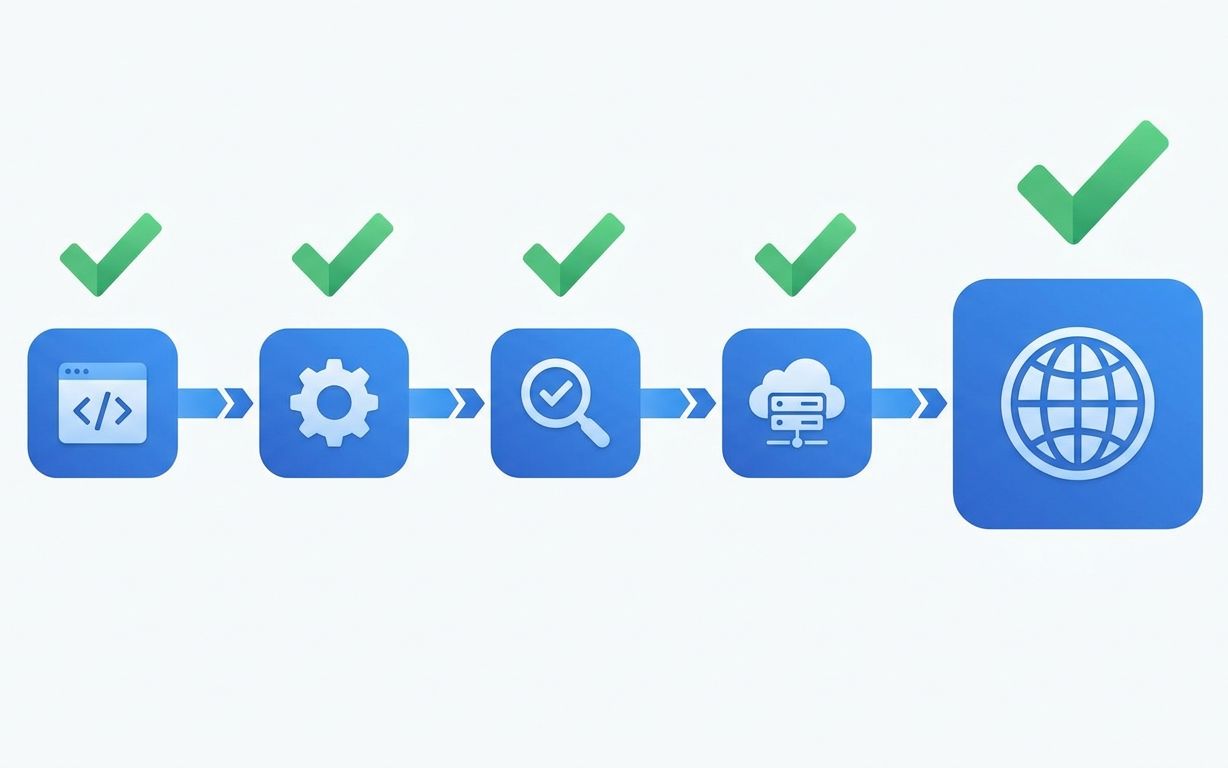
The 48-Hour Rebuild
We didn't redesign the site. We rebuilt it from scratch. Same brand, new everything else.
Day 1 (Hours 0-12): Architecture and content migration.
We mapped every URL from the old site and set up 301 redirects. This is the step that most rebrands botch. If you lose your existing URLs, you lose your existing search rankings. Every old URL needed to redirect to its new equivalent.
Content migrated from WordPress to a static Next.js build. Articles went into MDX files. We restructured the content into topic clusters: Bitcoin, Ethereum, DeFi, NFTs, Market Analysis. Each cluster got a pillar page that linked to all related articles.
The tech stack: Next.js with static generation, Tailwind CSS, Vercel hosting. No WordPress. No PHP. No MySQL database queries on every page load. The entire site became static HTML served from a CDN.
Day 1 (Hours 12-20): Design implementation.
The visual direction came from one insight: crypto audiences are not typical web audiences. They expect dark themes. They're data-literate. They want information density, not whitespace.
Design decisions:
- Dark background (#0a0a0a) with high-contrast text (#e5e5e5). Not pure black and white - those create eye strain. Slightly off-black and slightly off-white reduce fatigue during long reading sessions.
- Bold typography scale. Headlines in 48-64px. Body in 18px. Large type on dark backgrounds creates the visual impact that crypto brands need. We used Inter for body text (legibility) and a heavier weight for headlines (authority).
- Data widgets above the fold. Live price tickers, market cap, 24h volume. The old site buried market data below the article feed. We moved it to the top because that's what users came for. Real-time data fetched client-side so it didn't block static page generation.
- Content cards with thumbnail images. The old site used a standard blog list. We switched to a card grid that showed headline, excerpt, category, and reading time. More information per viewport. Fewer clicks to find relevant content.
Day 2 (Hours 20-40): Performance optimization and SEO.
This is where the real work happened. The visual refresh was important for brand perception, but the performance and SEO work drove the traffic results.
Performance optimizations:
- Static generation: Every page pre-rendered at build time. No server-side computation on each request. Load time dropped from 4.2s to 0.8s for cached pages, 1.1s for uncached. - Image optimization: All images converted to WebP with responsive srcsets. The hero image went from 1.2 MB to 180 KB with no visible quality loss. We used next/image for automatic optimization. - Zero render-blocking scripts: Analytics loaded async. Social widgets loaded on scroll. The carousel library was removed entirely (we replaced it with CSS scroll-snap). JavaScript bundle went from 480 KB to 89 KB. - Font optimization: Two font weights, preloaded, with font-display: swap. No layout shift from web fonts loading.
SEO implementation:
- Structured data on every page. Article schema for blog posts, Organization schema on the homepage, BreadcrumbList schema for navigation. This gave Google rich snippets to display in search results. - Consistent Open Graph and Twitter Card tags. Every page got a unique OG image generated from the article headline. Social sharing looked professional instead of showing a generic logo. - Fixed heading hierarchy. One H1 per page. H2s for sections. H3s for subsections. Simple hierarchy that search engines could parse correctly. - Internal linking. Every article linked to 3-5 related articles within its topic cluster. Pillar pages linked to every article in the cluster. This created a web of topical relevance that Google rewarded. - XML sitemap and robots.txt. Automated sitemap generation that only included published pages. Proper robots.txt that allowed crawling of all content pages.
Day 2 (Hours 40-48): QA and launch.
Cross-browser testing, mobile testing on 5 devices, link checking, redirect verification, and analytics setup. We ran Lighthouse one final time: Performance 96, Accessibility 94, Best Practices 100, SEO 100.
The Results: Month One
We tracked everything through Google Search Console and GA4. Here's month one vs the old site's best month:
| Metric | Old site (best month) | New site (month 1) | |---|---|---| | Impressions | 380,000 | 1,600,000 | | Clicks | 18,200 | 92,400 | | Average CTR | 4.8% | 5.8% | | Bounce rate | 72% | 41% | | Avg. session duration | 1:12 | 2:48 | | Pages per session | 1.4 | 3.2 | | Lighthouse Performance | 47 | 96 | | Page load time | 4.2s | 1.1s |
The 4.2x impression increase wasn't from new content. CryptoTicker published roughly the same number of articles both months. The increase came from:
1. Better crawlability. Google could parse the static HTML site much faster than the WordPress site with its 12 render-blocking scripts. Crawl budget was used more efficiently. 2. Improved rankings. 23 keywords moved from page 2 to page 1 in the first 3 weeks. Page speed is a ranking factor, and going from 4.2s to 1.1s moved the needle. 3. Rich snippets. Structured data gave CryptoTicker enhanced search listings (article dates, author names, breadcrumbs). Enhanced listings get higher CTR. 4. Topic authority signals. The internal linking structure and topic clusters signaled topical depth to Google. Instead of 200 unrelated articles, Google saw organized expertise in 6 crypto topics.
Why the Old Site Failed (It Wasn't the Design)
Here's the contrarian take: CryptoTicker's old site looked better than our rebuild in a portfolio screenshot. It had custom illustrations, animated transitions, and a polished feel. It would win a design award. It lost on performance, SEO, and user experience.
The old agency optimized for aesthetics. We optimized for outcomes. Those are different objectives that produce different results.
The animated transitions added 200ms to every page navigation. The custom illustrations were 800KB PNGs that weren't lazy-loaded. The polished feel came from JavaScript-heavy interactions that blocked the main thread.
A website isn't a gallery piece. It's a machine for converting visitors into engaged users. Every design decision should be evaluated against that purpose. Does this animation improve engagement? Does this illustration help the user understand the content? If the answer is "no, but it looks cool," cut it.
What We'd Do Differently
No project is perfect. Here's what we'd change:
More aggressive content pruning. We migrated all 200+ articles from the old site. Some of those articles were outdated, thin, or duplicative. We should have audited the content library and removed or consolidated low-quality pages before migration. Thin content dilutes topical authority.
Earlier A/B testing setup. We didn't implement A/B testing infrastructure until month 2. If we'd set it up at launch, we could have tested headline styles, CTA placements, and layout variations from day one instead of waiting.
Progressive image loading. We optimized image file sizes but didn't implement blur-up placeholder loading. On slow connections, images snap in rather than progressively appearing. Minor UX issue, but worth fixing.
The Takeaway for Your Rebrand
If your website is underperforming, a visual rebrand alone won't fix it. Most traffic problems are technical problems wearing a design mask.
Before redesigning anything, audit:
1. Page speed. If you're above 2.5 seconds on mobile, that's your first problem. 2. Crawlability. Can Google actually parse your pages? Render-blocking scripts, client-side rendering without SSR, and JavaScript-dependent content all hurt crawlability. 3. SEO fundamentals. Structured data, heading hierarchy, meta descriptions, internal linking. These are boring. They also account for 80% of organic traffic performance. 4. Content architecture. Is your content organized into topics, or is it a chronological list? Topic clusters signal authority.
Fix the technical foundation first. Then make it look good. CryptoTicker's 1.6 million impressions didn't come from a prettier design. They came from a faster, more crawlable, better-structured website that happened to also look good.
Frequently Asked Questions
How much did the CryptoTicker rebrand cost?
The project fell within our Brand and Marketing Sites tier starting at EUR 5,000. CryptoTicker's site was on the higher end of that range because of the content migration (200+ articles), custom data widgets (live price tickers), and the volume of 301 redirects. The exact price is confidential, but it was a fraction of what the original 3-month WordPress build cost.
Can performance improvements really 4x your traffic?
Performance improvements alone won't 4x traffic. The combination of performance, SEO fundamentals, content architecture, and structured data created the compounding effect. Think of it this way: better speed improves rankings. Better rankings increase impressions. Better structured data improves CTR. Better CTR signals relevance to Google, which further improves rankings. Each improvement feeds the others.
Should I rebuild my site from scratch or optimize what I have?
If your site has fundamental architectural issues (slow CMS, client-side rendering, no content structure), rebuilding is faster and cheaper than patching. If your site is technically sound but needs design and content improvements, optimize in place. CryptoTicker's WordPress site had too many structural issues to patch. A rebuild was the only efficient option.
How long did it take to see SEO results from the rebrand?
Impressions started climbing in week 2 after Google re-crawled the site. Significant ranking improvements appeared in weeks 2-3. The full 1.6M impression figure was a month-one total, so the ramp-up happened quickly. This is faster than typical SEO timelines because we preserved existing URL authority through 301 redirects and improved (rather than changed) the content.
*Is your website underperforming? Book a 30-minute call and we'll run a quick performance and SEO audit live on the call. Or see our Brand and Marketing Sites service for what a 48-hour rebuild includes.*
Notes on building fast.
One short email a month from the RalphNex team. Projects we shipped, ideas we tested, and what worked.
No spam. Unsubscribe anytime.

Aadil Ghani
Founder & CEO
Co-founder and managing director of RalphNex. Started coding at 14. Writes about building fast and the projects we ship.
More from the RalphNex Journal
How We Set Up CI/CD for Every Client Project
Every project we ship gets the same CI/CD pipeline. It takes 4 hours to set up and saves 200+ hours over the project lifetime.

SaaS Development for Edtech: Building for Schools and Students
Schools buy software in June, onboard in August, and complain in September. Your edtech product needs to survive all three.